When you put in a cassette order you want the finished product to look its absolute best. Following these steps not only makes our job easier, but it will ensure that your pad print will look just as gorgeous as intended. First you’ll need to place your order on our cassette duplication calculator, then we can get started!
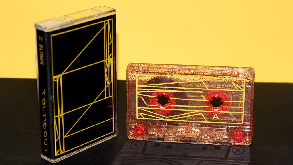
DESIGNING YOUR ARTWORK
1) Download our latest template
There are a few things to consider when designing pad print artwork for your order. First, what kind of shell have you chosen? Our templates have layers for opaque tapes, clear/windowless, and shells with square hub windows.
https://www.duplication.ca/printspecs/cassette-cover-templates.htm#padprint
Each template has useful information about designing artwork that is unique to each type of cassette shell chosen, so be sure to check if we have updated templates available with every order and follow the directions contained in the file!
2) Applications
First and foremost, we highly recommend you send us vector artwork, so you should be using applications such as Adobe Illustrator or CorelDraw to design vector logos and line text. Graphic design applications such as Adobe Photoshop or GiMP can be used, but bitmapped images will be subject to additional fees.
MEET THE MINIMUM REQUIREMENTS
1) Vector Artwork
We now require vector artwork for pad print. It helps us achieve finer lines with a fraction of the platemaking time. It’s best to create artwork as a vector image, but we recognize that sometimes images are sourced from bitmap files or hand drawings. Outside of CorelDraw and Illustrator, there are freeware websites that allow you to upload your image and they will trace the outlines to convert to a vector file. The results will vary and often depend on the complexity and quality of your source material. Some websites have more options than others, so be prepared for trial and error tweaking until you’re satisfied. Further tweaking can be done in programs like Illustrator, PhotoPea, or even Photoshop.
Here are a few websites worth checking out:
Rapid Resizer
Vectorization.org
Autotrace (Online Converting)
PhotoPea (click on Image -> Vectorize Bitmap)
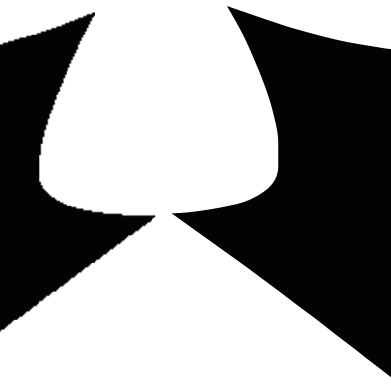
If you cannot retrace your images or convert to vector, we will be able to do it for a small fee. Bitmap images are also subject to a fee as they can take up to 20x as long to print the plate.
2) Grayscale
Regardless of your chosen ink colour, make sure your artwork is done in black. If you requested 2-colour pad print you’ll need to have each colour artwork in its own layer. The layers should be properly titled with their colour name (ex. one layer would be titled ‘Red’ and the other ‘Blue’). Again, regardless of the desired ink colour, each layer artwork must appear black.
3) Resolution
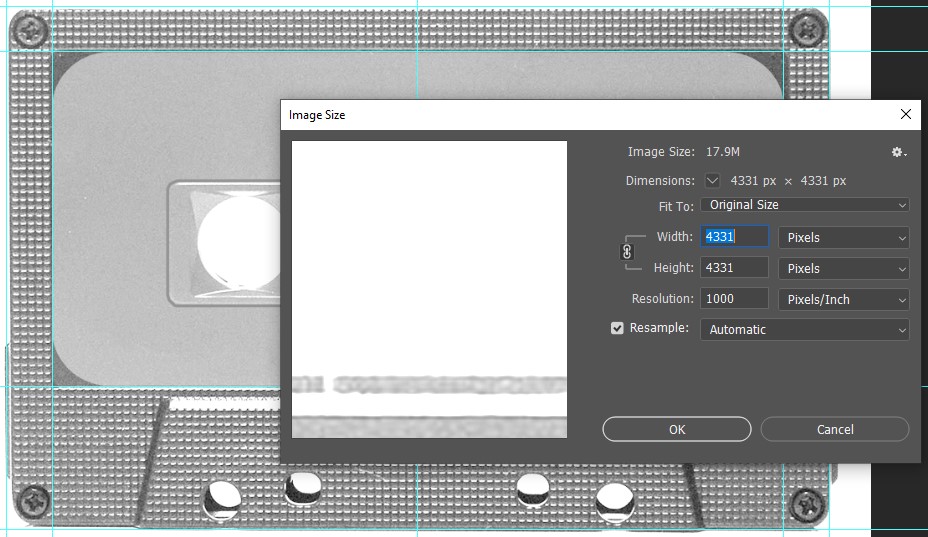
A low resolution can cause the finished product to look pixelated and of poor quality. If you are using Photoshop or your own template, ensure the dimensions and resolution are 4331 x 4331 pixels wide at 1000 ppi. Please note that resolution isn’t applicable when working with vector art.
4) Creating Outlines for Text
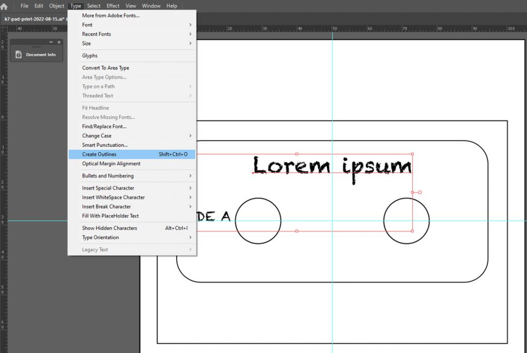
Often times we will receive a file with missing fonts, which means your meticulously curated typeface design will revert to a basic font style when we open the artwork file. But there’s an easy solution to this– simply Create Outlines for your text!
All you need to do is select your text, then navigate to the Type menu and select Create Outlines. The same can be done in Photoshop by selecting your text with the Direct Selection Tool and clicking on Convert to Shape in the Type menu. Avoid using faux font styling as it may not convert properly.
Another method is to ‘Expand’ your text. This video gives a quick explanation on how to do so:
5) Line Thickness
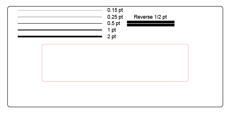
When you’re designing your artwork, you’ll want to keep an eye on line thickness. In order to ensure that your art will be visible when printed you’ll want your artwork lines to be at least 0.15 points thick. This is about the equivalent thickness of very fine hair. Anything less than 0.15 points risks not being visible on the final printed cassette. This applies to text as well.
Moreover, the knockout, gaps, or empty space between artwork also has to be a minimum of 0.5 points thick to properly print, otherwise there is the risk of ink running and filling up the empty space. Please make sure all empty space is at least 0.5 points thick to avoid spreading ink.

6) Mind the Gap
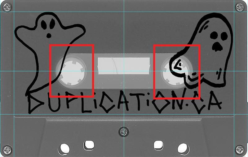
Depending on the type of shell you have chosen, there are areas you cannot print on. For example, there are two holes in every cassette shell which obviously cannot be printed on! Solid coloured shells, certain select clear shells, and square window shells have a recessed window in the center which can distort artwork, especially text. If you are uncertain about the type of shell you have chosen for your artwork, contact your sales representative!
7) Tell Your Sales Representative
Make sure that your sales representative knows exactly what your order needs, as there may be a price difference. If you want the A and B sides printed, it is “pad print two sides” on the cassette duplication calculator. If you just want the A side printed, it is “pad print one side.” If you’d like the exact same art on both sides, it is “pad print same art both sides.“
Once your artwork is complete and uploaded, let your sales representative know! They will double check your artwork to make sure it is compatible before sending it through to our pad print department. If you have any questions, be sure to reach out to them! They are happy to help!
Thank you for reading, and happy designing!
