When Do You Need”Double Hit” Pad Print on Cassettes?

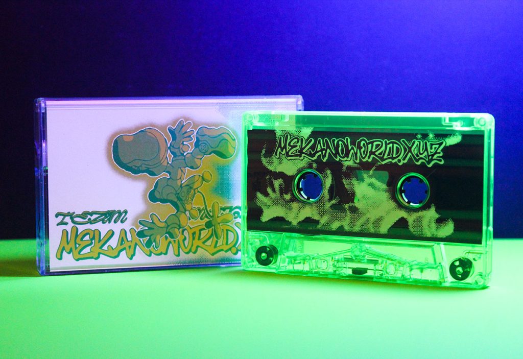
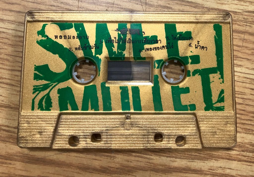
Team Mekano cassette with pad print

Longtime users of our outstanding cassette duplication services have no doubt noticed that a “double hit” option appears when selecting pad print artwork. We often receive questions from clients asking what “double hit” pad print entails and when it’s appropriate for their artwork. Here’s a breakdown:

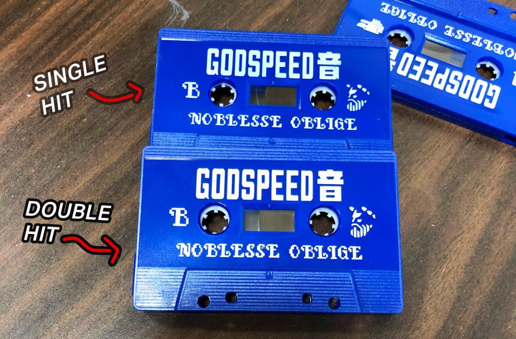
Single hit and double hit pad print

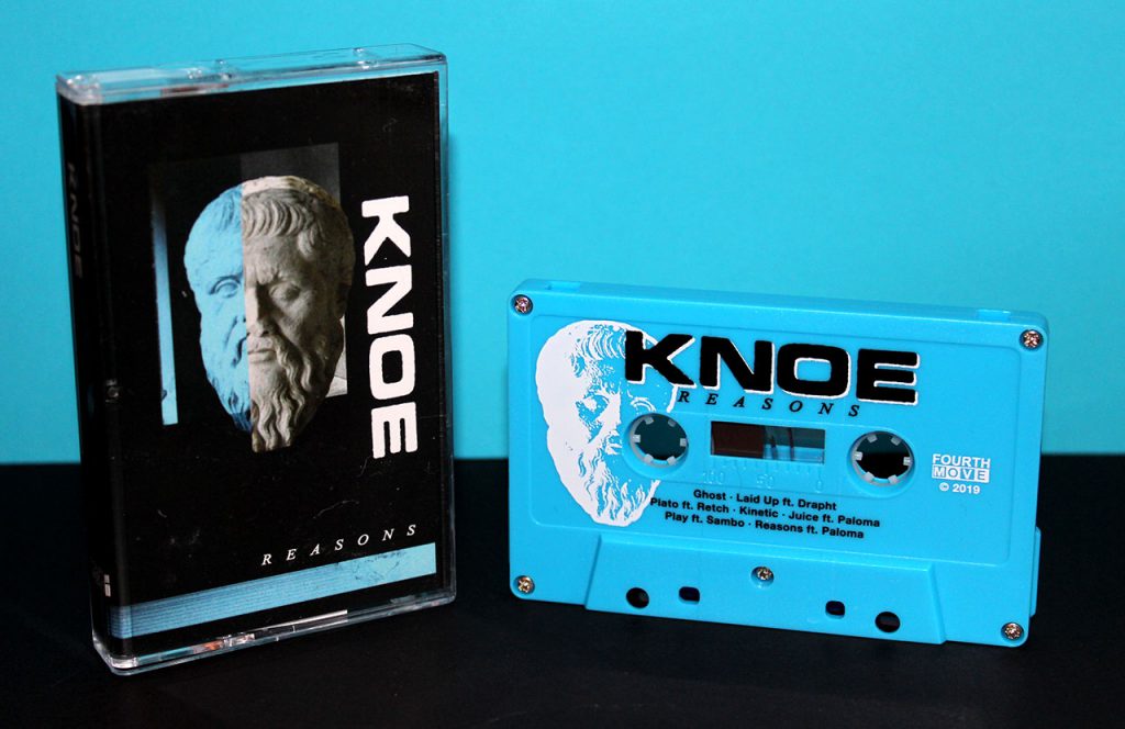
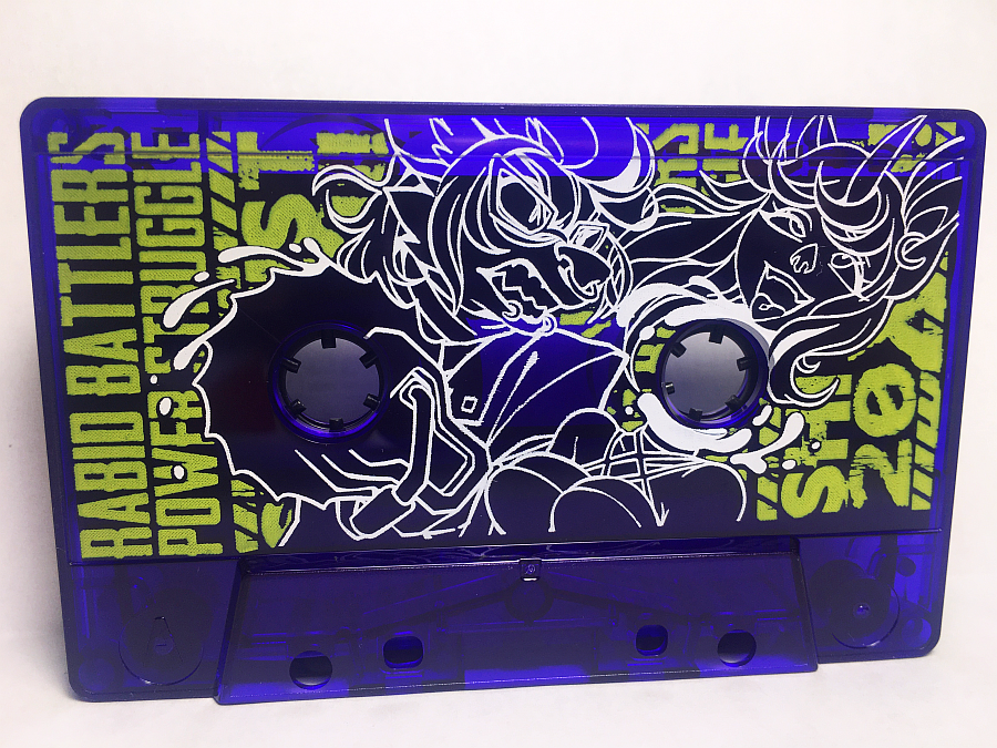
“Single hit” and “double hit” applies to how many times we machine-stamp the cassette with your artwork, “single hit” being the standard. So as you may have already surmised, applying a double hit stamp will give your ink colour more opaqueness and vibrancy. This is especially important when you’re stamping a light ink color on a dark color cassette shell, such as white ink on a black cassette. The more, the better.

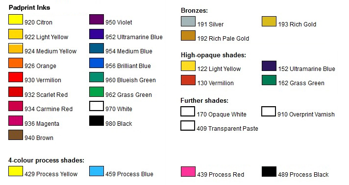
There are a couple of caveats to this approach. First, since more ink is laid down, thin lines may appear thicker or narrow gaps between the artwork may be filled with spreading ink. If you have thin lines in your pad print artwork, you may want to forego a double hit. Secondly, there are a number of inks that aren’t particularly opaque to begin with, and a double hit won’t change the ink vibrancy against a dark cassette shell. These inks include Brilliant Blue, Magenta, Yellow Lemon Citron, and Violet. (Orange is also not very opaque when used with single hit, but actually benefits greatly with double hit.)

List of pad print colors

The solution here isn’t to just settle with single hit, but to request a white base layer instead. Let’s say you want magenta against a black cassette shell: we will first lay down your artwork using white ink, and then again using magenta ink. This allows the magenta to pop out and shine against the black cassette shell as if you were printing it on a white cassette shell. White base layers are available by special request, at $25 CAD plus $.18 per hit, allowing for much more vibrant pad print at a low individual cost increase.

How to Add Bleed to Your Artwork

When sending us artwork for print, it’s necessary to add bleed to your image. For those who are not familiar, bleed is the area that goes past the template or trim lines. Failure to include bleed in your artwork may result in the possibility of small, unprinted edges appearing if there is any shift or movement in the printing press during the printing process. Yup, this is true even with massive professional printers that are big enough to take up a whole room. The fix is to add a bit of artwork beyond the template or trim lines, that way if there is a slight movement it will be imperceptible in the final printed image.

Some templates may already have bleed or “cut” lines! If so, you can simply fill the image up to the bleed lines.

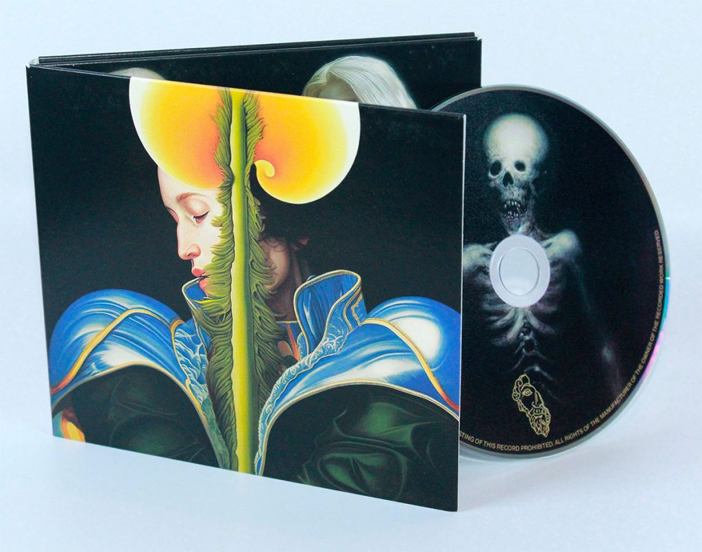
Printed CD wallets from Duplication.ca

How much artwork bleed should I add?

All you need to do is add about 0.125″ or 3.5mm of bleed to your artwork. If your artwork background is white or transparent, you don’t need to worry about bleed.

What’s the difference between bleed and the type safety area?

While the bleed is to supposed to extend beyond the trim or template lines, a title safe area is a way of ensuring your text won’t be cut off when printing. What’s the fix? Don’t place text or logos right up to the edge of the image. Make sure text is a minimum of 0.125″ away from the template/trim lines.

Show me an example of bleed.

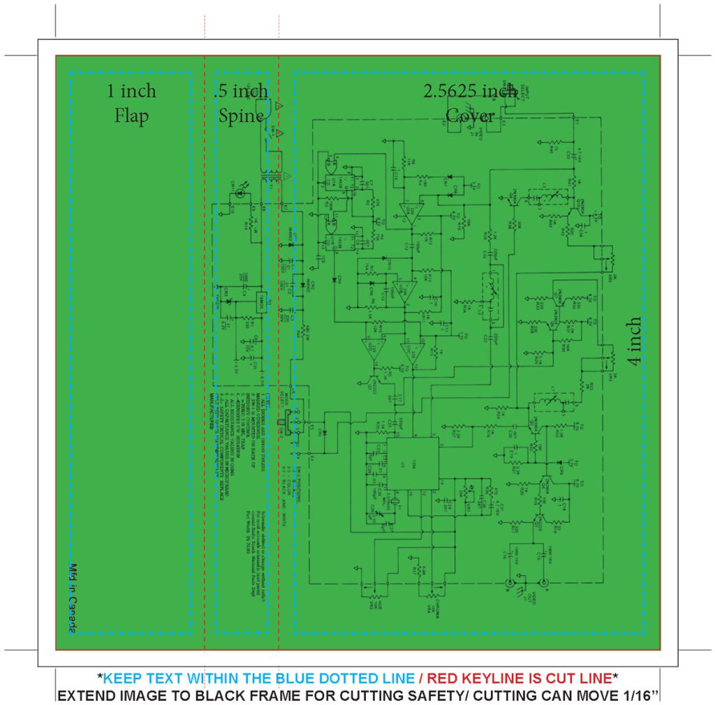
Okay, so let’s start with an example of the wrong way to submit artwork:

Cassette J-card template from Duplciation.ca

This J-card template has the image correctly placed in the title safe area, but you can see the green background doesn’t extend past the trim line. The J-card template includes an additional black box for bleed, but since the designer left it empty there’s a risk of white edges when printed and trimmed.

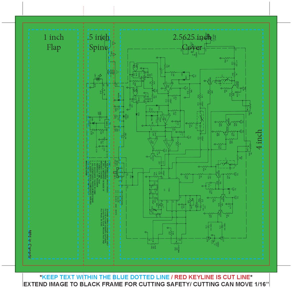
Here’s the correct way to submit artwork:

Cassette J-card template from Duplciation.ca

See how the artwork is extended ~3.3mm beyond the trim box? Now we know for certain that there won’t be white edges after trimming.

Hope this helps! Please let us know if you have any questions regarding printing. We have tons of printed products for cassette, CD, vinyl, and more available in our online store. Don’t leave the printing to the amateurs— we know printing presses inside out, and how to make your album look their absolute best!

Stock Updates August 2023

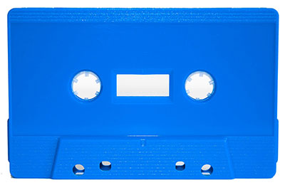
Light blue cassette restocked.

SKU TONRLIGHTBLUESW

Added RECYCLED white cassette labels. SKU CASS-LABELREC

This new label variant is made with recycled paper. It’s a bit less bright than the standard label stocks. Available in the online shop and with duplication orders.

Chrome tapes added to the online shop

C-20 Chrome in clear cassettes

https://www.duplication.ca/c-20-basf-pure-chrome-notch-tabs-in-with-grey-liners-loaded-with-high-chrome-notch-tape.html

C-85 Hi-Def Wasabi Bridge

https://www.duplication.ca/c-85-Fluorescent-Green-tabs-out-wasabi-bridge-loaded-with-chrome-tape-sku12798.html

C-100 Chrome

https://www.duplication.ca/c-100-Clear-with-black-liners-tabs-out-with-loaded-with-chrome-tape..html

See more in the Pre-loaded Type II blank tape category

Pre-Loaded Type 1 Normal Bias Blank Tapes

SKU12894 C-10 Magnolia SW (Tabs-OUT) loaded with HI-FI Tape
SKU12888 C-10 Transparent with Grey Liners (Tabs-IN) loaded with HI-FI Tape
SKU12904 C-11 Clear with Black Liners (Tabs-Out) loaded with Fox Tape
SKU12893 C-15 TINR Black (Tabs-OUT) loaded with Fox Tape
SKU12889 C-16 Red Tint with Screws (Tabs-OUT) loaded with HI-FI Tape
SKU12891 C-19 Smoke Tint Sonic (Tabs-OUT) loaded with HI-FI Tape
SKU12892 C-20 Blue Tint Sonic (Tabs-OUT) loaded with HI-FI Tape
SKU12902 C-22 Smoke Tint Sonic (Tabs-Out) loaded with HI-FI Tape
SKU12903 C-33 Clear with Black Liners (Tabs-Out) loaded with Fox Tape
SKU12896 C-38 Clear with Black liners (Tabs-Out) loaded with hi-fi Tape
SKU12897 C-41 White matte (Tabs-Out) loaded with hi-fi Tape
SKU12900 C-42 Red transparent screw GRUNGY (Tabs-Out) loaded with fox Tape
SKU12898 C-45 Clear with Grey Liner (Tabs-Out) loaded with hi-fi Tape
SKU12899 C-47 Red transparent screw GRUNGY (Tabs-Out) loaded with hi-fi Tape
SKU12890 C-50 TONR GOLD SW (Tabs-OUT) loaded with HI-FI Tape
SKU12901 C-73 Frost with Grey Liners and Screws (Tabs-Out) loaded with HI-FI Tape

See more in the Pre-loaded Type I tape category

Design cassette J-cards and sticker labels online

Design cassette J-Cards and sticker labels online

Once upon a time we had the ability to design J-cards and sticker labels through the browser on the online store. Due to a software update we had to temporarily disable the feature, but thanks to some elbow grease and coding we’re happy to announce that the online designer has returned. No need to use expensive graphic design software, you can now create your J-cards and sticker labels online and absolutely free!

Creating and ordering J-cards and sticker labels couldn’t be easier. First off, head to the product of your choice. For the sake of an example, let’s say you wanted to order double-sided J-cards.

You’ll notice that above the product description there’s a button that reads ‘Add Your Design’. Click on that to start designing!

Right off the bat you’ll see that our JP0 template has already loaded. From here you can use the icons on the top and the bottom to do simple design functions, like add a background colour, upload images, and add text. You can even import images from your Instagram account!

Here’s what I whipped together in a matter of minutes. I simply made the background black, and then I added two images for the left and right panels, making sure the art bleeds past the red template lines. I threw on some text, stylized the angle and added a black stroke for the sake of legibility. Just like that, I have the front cover of my cassette ready to go. To work on the reverse side you need to click on the icon below the template.

Once you’re done, click ‘Download’ on the top right corner and save the file as a PDF. This way you have a copy of your own for safety and posterity. After that you can smash that big red ‘Submit’ button.

Now you’ll see that your artwork has been added to the order page! Don’t forget to give your order a ‘Project Title’, that’ll help with organizing files in the event you’re ordering more than one batch of printed goods. Click ‘Add to cart’ and you’re good to go!

All this applies to sticker labels as well, our online designer is ready to go with the proper template set for your masterpiece. No cloud subscription services, and no sketchy cracked software needed. Start designing today!

Click here to order J-Cards with up to 4 extra panels with your online design

Click here to design and order cassette sticker labels

What is a Prison Tape?

A Completely Transparent Look at Prison Tapes

While audio cassettes were replaced by new formats and technologies only to return to the underground music scene, there is one institution where they never went out of style: prisons. In fact, in many penitentiaries the only way to listen to music is through a cassette tape.

CDs have been deemed dangerous as they can easily break and become weaponized, and while some prisons allow MP3 players they’re not of much use without an internet connection to load files. Thus the cassette tape is the reigning audio format for inmates, but with certain regulations. They need to adhere to the ‘Prison Tape’ model, which is to say completely transparent and sonic welded, as to avoid smuggling contraband. The packaging also needs to be completely transparent to minimize the time spent for inspection before the product enters prisons.

Clients have been ordering prison tapes from Duplication.ca for decades, sending cassettes to friends, loved ones, or customers. They’re the ideal format if you’d like to pass around mixtapes, song demos, sermons, or other voice recordings. We’ve created a shop page to make the process even simpler— just choose your audio length and we’ll load it to a Prison Tape which meets the standard requirements.

Click here to order blank Prison Tapes

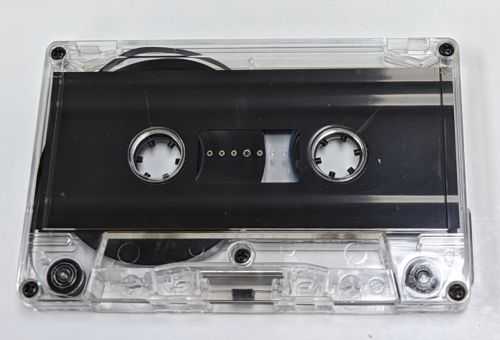
If you’d like us to duplicate audio, we can do that as well! Simply choose ‘Transparent w/ Black Hubs’ from the shell colour menu of our cassette duplication page. Cassette case packaging regulations may differ depending on the penitentiary, so please be sure to do research before ordering.

Order duplicated Prison Tapes

Guide to CD Silkscreen Design

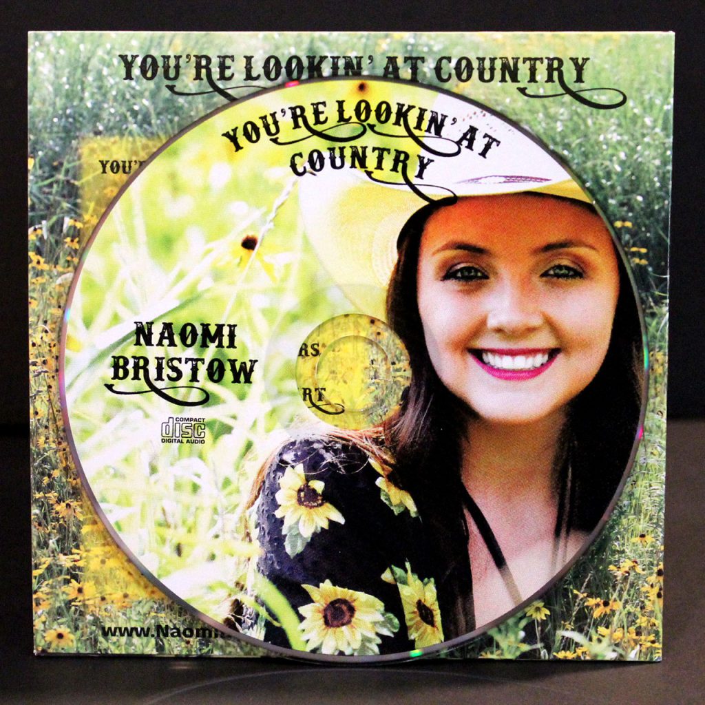
For the highest quality printed CDs, DVDs, or Blu-Rays, you will undoubtedly want to choose silkscreen printing. We can print up to four solid colours, or full colour CMYK if you wish to print a photograph or gradients. Designing silkscreen print artwork is a little different from designing album artwork, as colours will have to be separated for us to use the proper ink. Here are some tips for designing silkscreen disc artwork!

2 color silkscreen disc printingAn example of 2-colour silkscreen printing
Don’t Use Photoshop

While many of us who have dabbled in graphic design are most comfortable using Photoshop, we do not recommend it in the case of silkscreen disc design. You should be using Adobe InDesign, Adobe Illustrator, or CorelDraw. The main reason is that instead of using layers or colour fills like you would in Photoshop, you’ll want to instead use Pantone swatches. Which brings us to our next point…

Start Using Pantone Colours

Pantone is an organization system for a wide range of colours. Each pigment or tint is assigned an alpha-numerical identifier, so for example Electric Blue would be Pantone 2727c. Ideally, as a graphic designer you would refer to a Pantone swatch booklet which would have every colour number, that way you’re not reliant on a computer monitor whose colour calibration may be a little bit off.

By using Pantone swatches in Adobe InDesign, Illustrator, or CorelDraw, we know exactly which ink colour to use. Your desired hue of blue won’t be too bright or dull, for we know to use the 2727c ink. If you don’t use Pantone swatches, you will need to tell us which pantone number to use for each colour.

How to find Pantone swatches in Adobe Illustrator

Separate the Colours

Let’s say you chose 2-colour silkscreen as your disc print option, and you’d like a red design against a black background. You can’t simply send us a rasterized or flattened jpeg with your artwork, these two colours need to be separated from one another. Simply having each desired colour on a separate layer will not suffice, we must be able to remove colour channels for the whole file like in the video below. Please note that white counts as a colour, empty space in artwork will reveal the silver disc.

High Resolution Text

We recommend adding the text through InDesign, which will give it the sharpest quality and highest resolution possible. If your text is stylized (stretched, bent in a circle, etc.), we recommend Adobe Illustrator as that is the ideal program for vector graphics.

CMYK Printing is a Different Story

If you have a photograph you’d like to use for the disc artwork, maybe a picture of the band or a broken down Chevy, you’ll want to use full-colour CMYK. The approach to CMYK printing is much simpler, it doesn’t require any colour separation or Pantone matching. Simply place the high resolution image in the template and that should suffice.

CMYK + White silkscreen disc printing
An example of full CMYK printing

Use Our Templates and Hire a Designer

If this is your first rodeo to graphic design, you may want to look for outside help. A professional designer will have all the tools and knowledge to complete the job. We also offer graphic design services, and since we’ll be the ones printing the discs we’re going to get it right on our first try. Don’t forget to supply your artwork using the Duplication.ca templates!

You may find this guide to be a bit overwhelming, but it’s the road you need to take for brilliant and beautiful silkscreen disc printing. All of the above are industry standard guidelines, which allows us to provide you with the highest quality printed silkscreen so your album artwork is as loud as your music.

CLICK HERE TO ORDER PROFESSIONAL CD PRESSING WITH BEAUTIFUL SILKSCREEN PRINT

Guide to Designing 2-Color Pad Print

GUIDE TO DESIGNING 2-COLOR PAD PRINT

2-color pad print is the perfect solution if you want your cassette face design to pop right off the shell. This service is available by special request, you can mention it in the ‘Notes’ section of your cassette duplication order and we’ll send you an updated quote. But before you jump into designing your 2-color pad print artwork, there’s some restrictions to keep in mind. Here’s the breakdown:

Templates

We will require that you provide your artwork in our templates, without exception. Since your two-color artwork may need increased accuracy in its placement we cannot manually move your artwork into our templates and risk losing its proper alignment. Our pad print templates can be found here.

We now ask that our clients send us vector artwork as opposed to bitmap. This allows us to print higher quality images with finer lines and sharper text. Adobe Illustrator is your best bet for vector image design.

Files

Each color and side should be its own individual file. So if you are designing a two-sided cassette with green and black on each side, your files names should be similar to the following:

Side A – Green.PDF
Side A – Black.PDF
Side B – Green.PDF
Side B – Black.PDF

Color Order

When choosing your two pad print colors, you need to be clear as to which color is the foreground (top layer) and which is the background (bottom layer). For the best results, the lighter color should be the background. Light ink will not print well on top of dark ink, such as yellow on top of black. However, black on top of yellow will be easily visible.

Trapping

We strongly discourage very accurate layer placement, such as a second color being used as an outline or drop shadow for text and images. Tight registration or perfect placement for two color pad print takes considerably longer to set up, and the printing pad tends to shift over time, meaning that we will eventually reach a point where the two ink placements are slightly offset.

As such, we require a trapping of 2 points between color layers. Trapping is a printing term for overlap, so if you wish the two colors to touch the foreground ink must overlap the background ink by 2 points. If you don’t add an appropriate amount of trapping you will risk there being empty space between the two colors.

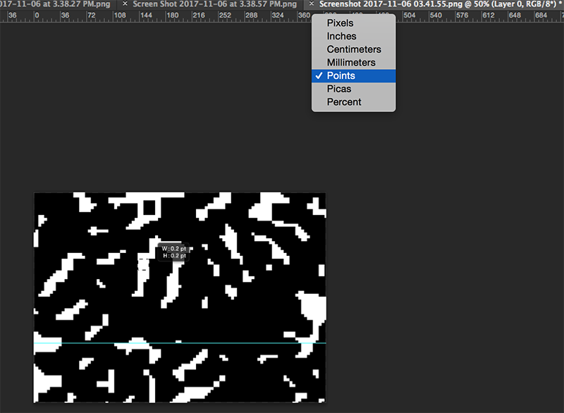
Points is a unit of measurement that you can find in your design application. To change the unit of measurement in Adobe Illustrator, simply right click on the ruler and switch to Points.

If you have any questions, don’t hesitate to email us or send us a message on our live chat service.

Order cassette duplication from Duplication.ca!