GUIDE TO DESIGNING 2-COLOR PAD PRINT
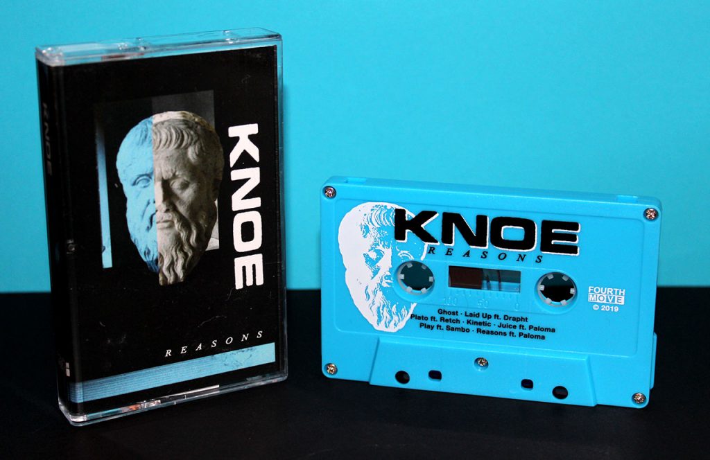
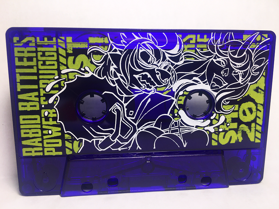
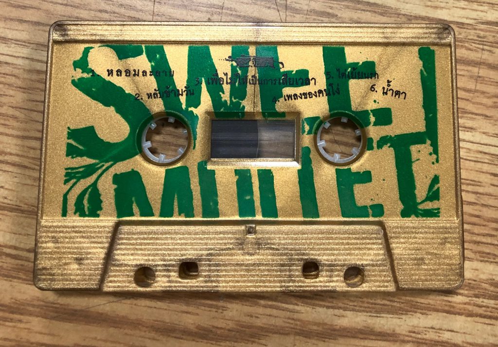
2-color pad print is the perfect solution if you want your cassette face design to pop right off the shell. This service is available by special request, you can mention it in the ‘Notes’ section of your cassette duplication order and we’ll send you an updated quote. But before you jump into designing your 2-color pad print artwork, there’s some restrictions to keep in mind. Here’s the breakdown:
Templates
We will require that you provide your artwork in our templates, without exception. Since your two-color artwork may need increased accuracy in its placement we cannot manually move your artwork into our templates and risk losing its proper alignment. Our pad print templates can be found here.
We now ask that our clients send us vector artwork as opposed to bitmap. This allows us to print higher quality images with finer lines and sharper text. Adobe Illustrator is your best bet for vector image design.

Files
Each color and side should be its own individual file. So if you are designing a two-sided cassette with green and black on each side, your files names should be similar to the following:
Side A – Green.PDF
Side A – Black.PDF
Side B – Green.PDF
Side B – Black.PDF
Color Order
When choosing your two pad print colors, you need to be clear as to which color is the foreground (top layer) and which is the background (bottom layer). For the best results, the lighter color should be the background. Light ink will not print well on top of dark ink, such as yellow on top of black. However, black on top of yellow will be easily visible.
Trapping
We strongly discourage very accurate layer placement, such as a second color being used as an outline or drop shadow for text and images. Tight registration or perfect placement for two color pad print takes considerably longer to set up, and the printing pad tends to shift over time, meaning that we will eventually reach a point where the two ink placements are slightly offset.
As such, we require a trapping of 2 points between color layers. Trapping is a printing term for overlap, so if you wish the two colors to touch the foreground ink must overlap the background ink by 2 points. If you don’t add an appropriate amount of trapping you will risk there being empty space between the two colors.

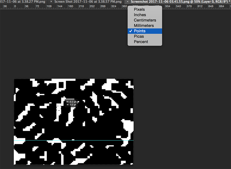
Points is a unit of measurement that you can find in your design application. To change the unit of measurement in Adobe Illustrator, simply right click on the ruler and switch to Points.
If you have any questions, don’t hesitate to email us or send us a message on our live chat service.


